| LIBROW | ® |
| Products | Solutions | Vehicles | Articles | Inquiry | Contacts | My account |
Service
Graphical design for digital instrument clusters
Introduction
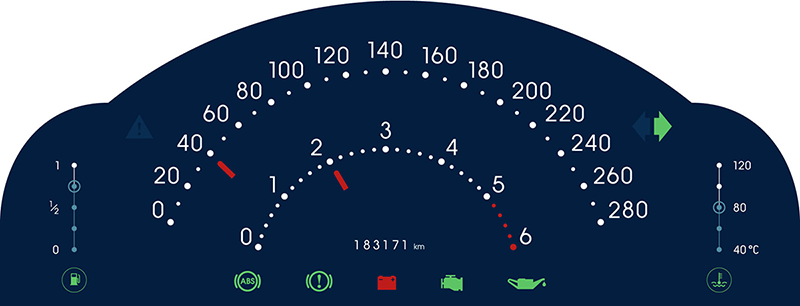
Digital instrument clusters are virtual ones. Now metal and plastic replaced with dynamic image, which leads to new field of opportunities:
- skinnable, configurable dashboard — the cluster can have several designs: day and night, comfort and sport
- interactivity — adding touch-screen or joystick opens access to car settings like trip counter, clocks, set of displayed parameters
- virtuality — indicators and meters can behave the way impossible for real-metal boards
 Fig. 1. Digital instrument cluster graphical design.
Graphical design
Graphical design falls into three important parts:
- infographics
- usability
- interface
Infographics — automotive dashboard is all about graphical representation of the car state information. Whatever the representation could be in any case it should be crystal clear and definitive. It should be easy to interpret the cluster at just a glance, with minimum efforts.
Usability — it should be comfortable to use dashboard, which leads to idea of parameters priority, proper indicator placing, sizing and color coding.
Interface — obviously the dashboard is interface, which speaks to the driver, and this point gets more important in the case the cluster is interactive. The language of interface should be clear and should help to find the shortest way to the goal, like setting the clocks or resetting the trip counter.
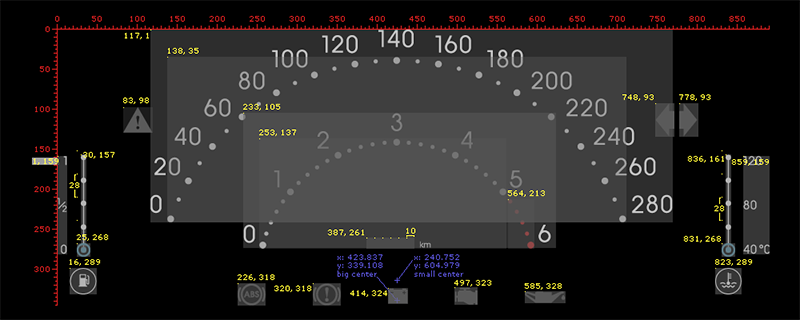
 Fig. 2. Digital instrument cluster graphical design layout.
Our offer
Comprehensive service in graphical design for digital instrument clusters
|
Other services
| Solution Manufacturing of digital instrument clusters |
|
| Service Graphical design for digital instrument clusters |
|
| Service Hardware for digital instrument clusters |
|
| Service Firmware for digital instrument clusters |
|
| Service Housing for digital instrument clusters |
|
| Solution Manufacturing of body control modules |
|
| Solution Manufacturing of power distribution modules |
|
|||||||||||||
|
|||||||||||||


